HAnnah Tatman
Decoding forms with blue foam
When you think of a tube of toothpaste, what image pops in your head?
Probably one of a seven-to-eight inch cylinder that tapers at one end.
My goal was to experiment with form and see what other options
are out there for a regular old tube of toothpaste.
the outline
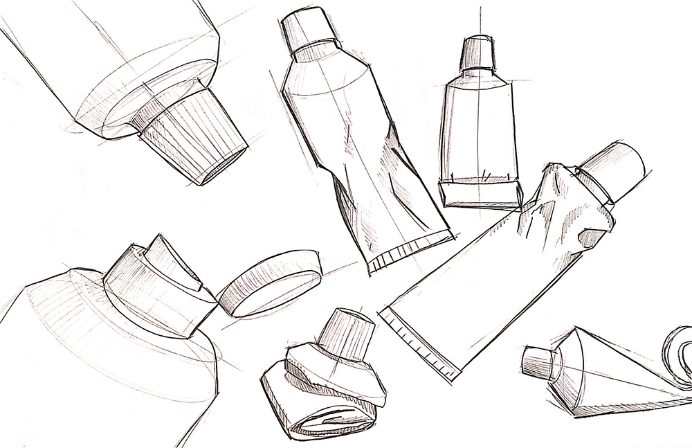
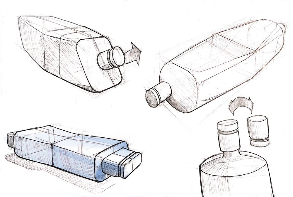
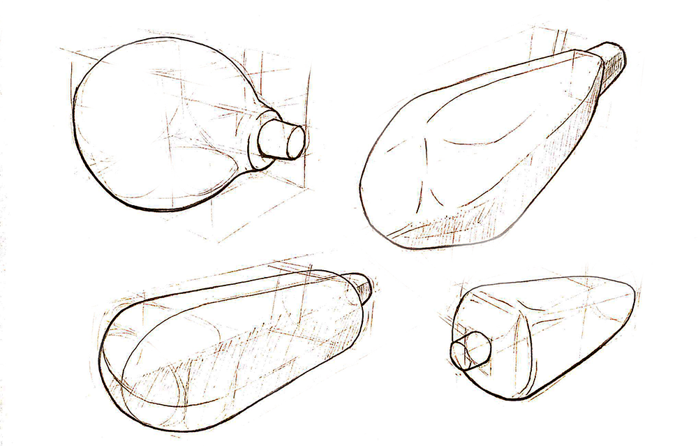
For this project, I created ten different variations of toothpaste tubes. I chose this design because it is a product that most people living in our society interact with on a daily basis. With this form study, I aimed to explore not only the aesthetics; I wanted to see if I could improve upon a form that has not been majorly changed for a while.
There were several challenges in dealing with this product. Firstly, the success of a toothpaste tube relies heavily on the material it is made of. I had to find a way to represent form without necessarily relying on the construction material. The forms also needed to take into account how it feels in the hand when held with only one hand, or both hands. Overall, this project gave me insight into the world of product design.
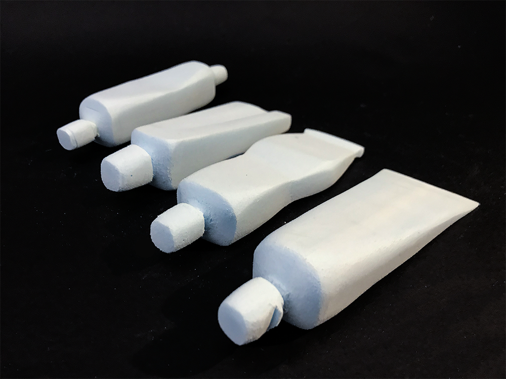
Form 1: The Original
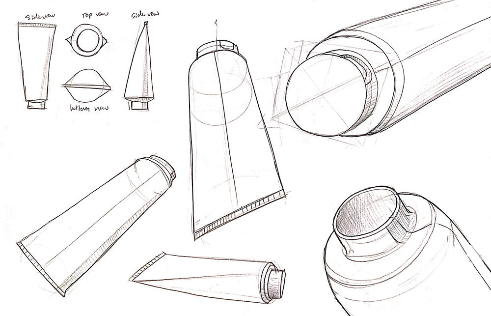
This model was based off of a a regular Colgate toothpaste tube that had readily available in my dorm. It is a very simple; just a cylindrical shape with a tapered end. There was not a lot of room to simplify this form, but I did end up not including any branding or writing that was on the original product. This blue foam model was my starting point for my project.
Form 2: The Bellows
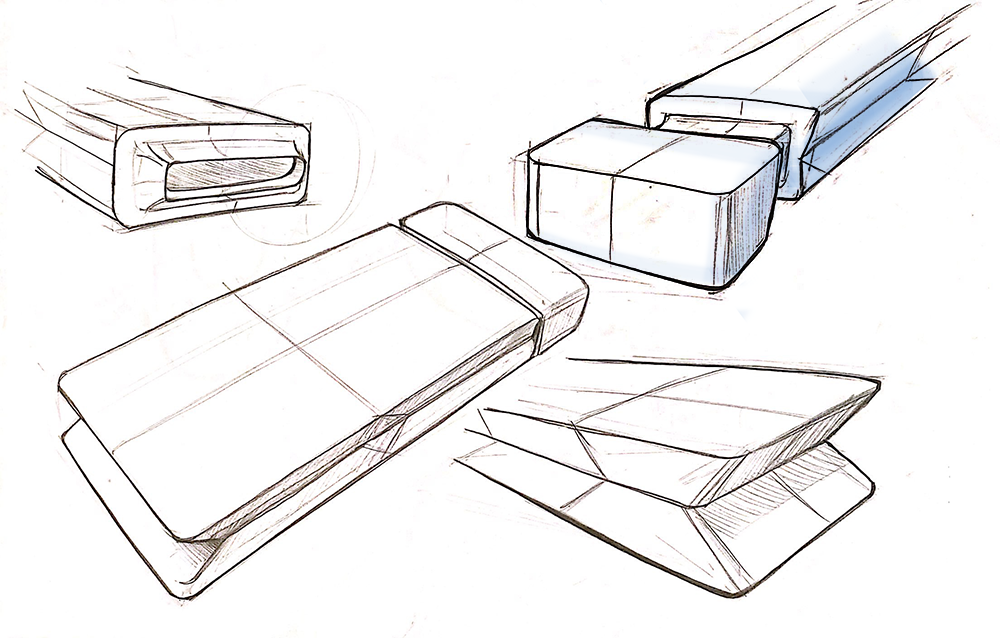
This form was based on the bellows which is a device constructed to furnish a strong blast of air when stoking a fire. I wanted to encourage the user to empty the toothpaste tube in a controlled manner, rather that just squeezing it willy-nilly one handed. The ridge going down the center of the tube allows for compression.
Form 4: The Origami
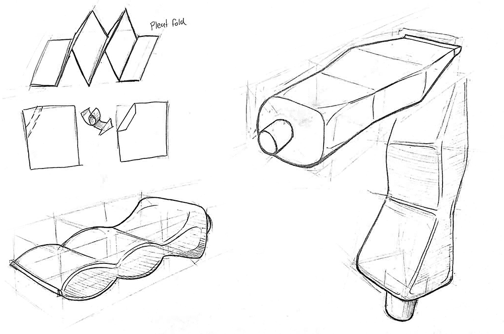
This product was inspired by the origami pleat fold. The fold lines alternate between valley and mountain folds. I wanted to inspire the user to compress the toothpaste tube cleanly. The lines that break up the length of the form give users a place to squeeze to. This is so they don’t squeeze the entire tube, only up to a certain point.
Form 5: THe molar
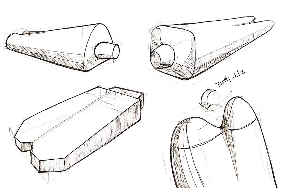
Similar to the third form, the Cleft, this blue foam model has a depression running down half of the length of the tubes. The bottom end of this tube is designed to be easier to manufacture, thanks to the rounded ends. This form reminded me of the roots of a molar, which inspired the name.
Form 7: the bottom heavy
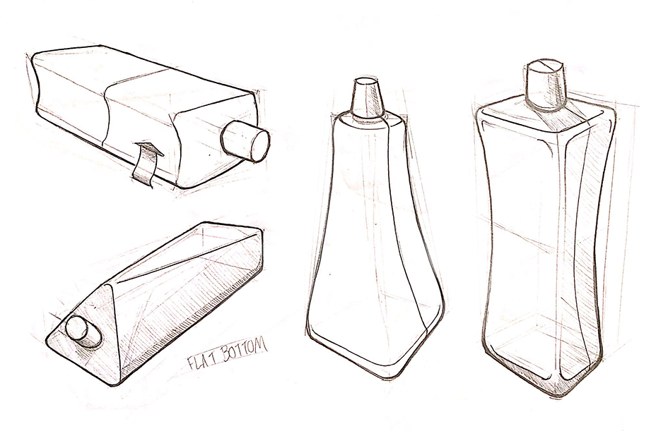
I wanted to create a toothpaste tube that can stand up on the opposite end. I realized that after making this, when the toothpaste is squeezed out, it would no longer be able to stand up. Also, this reminds me too much of a shampoo bottle. This form would not be the best for the needs presented when emptying regular toothpaste.
Form 9: The juice Box
With this design, I imagined that it would be manufactured out of a thicker material, such as cardboard, similar to a juice box. The angular design allows it to be folded, similar to the Bellows blue foam model. This is due to the rigidity of the material. I enjoyed the feel of this model when held.
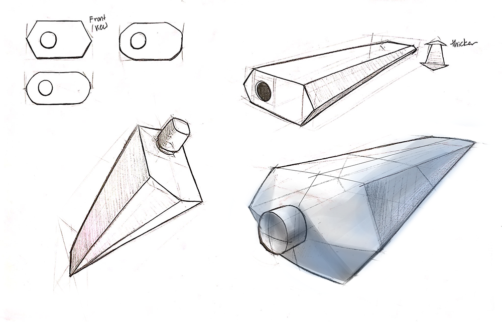
Form 10: THe curved
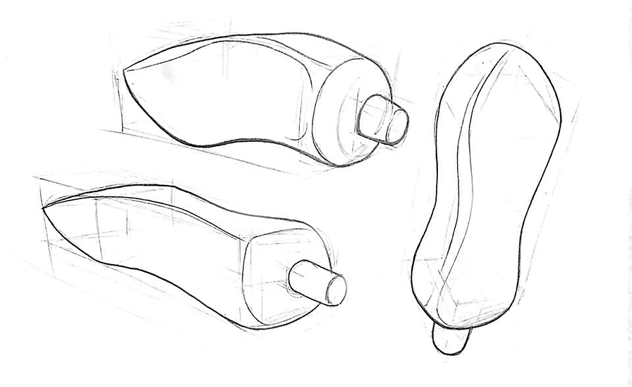
This design is based off of the perfectly wave-like dollop of squeezed toothpaste you see in every toothpaste commercial. The curves add a visual interest; a far cry from the boring lines of the original toothpaste tube. This design would be hard to manufacture due to the end converging to a point.
Final thoughts
Overall, this assignment taught me a lot about creating prototypes. I tried to balance user needs, design aesthetics, and manufacturing capabilities when coming up with the models. Some models accomplish one of those three points better than others. If I had to do this assignment over again, I would pick an object that relied less on it’s material to create its form. My classmates all redesigned more rigid consumer products, such as remotes, knife handles, and even doorknobs. By picking a more rigid product, I would be able to focus even more attention on its form.
